Welcome to the
Kaya AI Brand Toolkit
Kaya AI is built on the principles of simplicity, clarity, and transformative potential. Our brand represents trust, inclusivity, and the power of advanced AI technology to improve lives. To maintain consistency and resonate globally, we’ve created this toolkit to guide the application of our brand across all platforms.
Our Visual Identity
Logo
The Kaya AI logo is the cornerstone of our brand. It embodies the intersection of innovation and accessibility, representing the infinite possibilities of AI.
Primary Logo: For digital and print use in full color.
Monochrome Logo: For one-color or black-and-white use cases.
Spacing: Maintain a clear space around the logo equal to the height of the “K” in Kaya.

Color Palette
Our colors reflect the harmony of technology and humanity. Use them thoughtfully to create a seamless connection between our brand and its audience..
Kaya Primary (#005630): Symbolizing growth and sustainability.
Future Gray (#121212): For balance and neutrality.
Radiant White (#FFFFFF): To create openness and clarity.

Typography
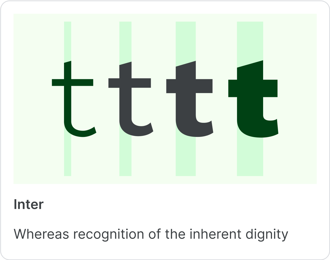
Typography is a key element of the Kaya AI brand identity. It ensures consistency and clarity across all platforms where our brand is represented. We have selected Inter as our primary typeface due to its modern, clean, and highly legible design, perfectly aligned with Kaya’s values of innovation and simplicity.
Primary Typeface
Font Name: Inter
Weights: Bold, Medium, Regular, and Light
Usage: Headlines, body text, and callouts across all branded materials.
Fallback Fonts
Arial or Helvetica (for systems where Inter is unavailable).
Platform Consistency
The Inter typeface should be used consistently across all platforms, including but not limited to:
Design Tools: Adobe Photoshop, Figma, Sketch, Canva.
Presentation Tools: Google Slides, Microsoft PowerPoint, Keynote.
Web Applications: HTML/CSS (via Google Fonts or locally hosted).
Documents: Word, Google Docs, and PDFs.
Installation and Usage
To ensure consistency, download and install the Inter font across all your devices. Integrate it into your design and collaboration tools to maintain the Kaya AI look and feel.
Voice and Tone
At Kaya AI, our tone is professional yet approachable. We speak with clarity and purpose, ensuring our message resonates across diverse audiences.
Confident: Highlighting reliability and expertise in every interaction.
Human-Centered: We connect emotionally without sacrificing precision.
Solution-Focused: Addressing challenges with actionable insights.

Brand in Action
Imagery
Our imagery combines human stories with abstract visualizations of data and AI processes. Use images that are vibrant, inclusive, and forward-thinking.
Usage Guidelines
Always represent the Kaya AI brand consistently by adhering to these guidelines:
Avoid distorting the logo or using unapproved colors.
Respect spacing and size requirements.
Ensure all content aligns with our voice and tone.
Need Help?
Have questions or need additional assets? Our team is here to support you.